
Customize dashboard
The Customize Dashboard panel allows you to configure the dashboard layout, appearance, and content. From this panel, you can define dashboard properties, customize the visual style, and add widgets and reports to the dashboard canvas.
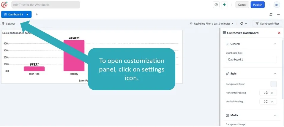
General
Section titled “General”Dashboard Title
Section titled “Dashboard Title”The Dashboard Title specifies the name displayed at the top of the dashboard.
Use a meaningful title that clearly describes the purpose of the dashboard, such as:
- Sales Performance
- Executive Summary
- Monthly Revenue Analysis
- Inventory Overview
The dashboard title can be modified at any time.
The Style section allows you to customize the overall appearance of the dashboard.
1. Background Color
Section titled “1. Background Color”Select a background color for the dashboard canvas.
Choose a color that complements your widgets and improves readability.
2. Horizontal Padding
Section titled “2. Horizontal Padding”Specify the horizontal spacing between the dashboard edges and the widgets.
Increasing the padding creates additional white space, resulting in a cleaner and less cluttered layout.
3. Vertical Padding
Section titled “3. Vertical Padding”Specify the vertical spacing between the dashboard edges and the widgets.
Adjust this setting to improve the overall visual balance of the dashboard.
1. Background Image
Section titled “1. Background Image”You can upload or select an image from the media library to use as the dashboard background.
Common uses include:
- Corporate branding
- Company logos
- Watermarks
- Decorative backgrounds
When using a background image, ensure it does not reduce the readability of dashboard content.
Widgets
Section titled “Widgets”The Widgets section contains the available widget types that can be added to the dashboard.
To add a widget:
- Select the required widget from the list.
- Drag it onto the dashboard canvas.
- Position and resize it as required.
Available widget types include:
1. Text
Section titled “1. Text”Displays headings, instructions, descriptions, or other informational content.
Use Text widgets to organize your dashboard into logical sections or provide context for reports.
2. Image
Section titled “2. Image”Displays an image from the media library.
Image widgets can be used for:
- Company logos
- Icons
- Banners
- Illustrations
- Branding elements
3. Icon
Section titled “3. Icon”Displays an icon from the available icon library.
Icon widgets can be used for:
- Visual indicators
- Highlighting dashboard content
- Supporting headings or labels
- Adding visual context to reports
You can add this under the Icon section:
- Default icons – Choose from 16 predefined icons.
- Custom icons – Copy paste custom SVG code.
4. Empty
Section titled “4. Empty”Creates an empty container that can be used as a visual placeholder or layout element.
This widget is useful for creating spacing or grouping dashboard content.
5. Summary
Section titled “5. Summary”The Summary widget uses AI to generate a natural language summary of selected reports on the dashboard.
The generated summary helps users quickly understand key insights, trends, and highlights without manually reviewing every report.
Typical use cases include:
- Executive dashboards
- Management summaries
- Performance overviews
- High-level business insights
The summary is generated based on the reports selected for analysis.
6. Reports
Section titled “6. Reports”The Reports section displays all reports that have been created and saved by the user.
Each saved report can be added to the dashboard as a Report Widget.
To add a report:
Section titled “To add a report:”- Locate the report in the Reports list.
- Drag the report onto the dashboard canvas.
- Position and resize the report widget as required.
The report retains its visualization and configuration from the saved report.
Search Reports
Section titled “Search Reports”Use the Search box to quickly locate a report by name.
This is particularly useful when working with a large number of saved reports.
Create a New Report
Section titled “Create a New Report”Select the + button in the Reports section to create a new report directly from the dashboard customization panel.
Once the report is saved, it becomes available in the report list and can be added to the dashboard.
Report Information
Section titled “Report Information”Each report includes an Information icon that displays below details about the report, helping you identify the correct report before adding it to the dashboard.
- Report Name
- Datasource it is connected to
- Datasource connection type: Live or Real-time
- Type of Database it connected to
Building a Dashboard
Section titled “Building a Dashboard”A typical dashboard can be created using the following workflow:
- Specify a dashboard title.
- Customize the dashboard appearance by selecting a background color or image.
- Adjust horizontal and vertical padding to achieve the desired layout.
- Drag and drop Text, Image, Empty, or Summary widgets onto the dashboard.
- Drag saved reports from the Reports panel onto the dashboard canvas.
- Arrange and resize widgets to create the desired layout.
- Save the dashboard once all widgets have been configured.
Best Practices
Section titled “Best Practices”- Use a clear and descriptive dashboard title.
- Maintain consistent spacing using the padding settings.
- Use Text widgets to organize reports into meaningful sections.
- Include Image widgets only when they add value, such as branding or visual context.
- Use the AI Summary widget to provide executives and business users with a quick overview of key insights.
- Keep dashboards uncluttered by displaying only the most relevant reports.
- Arrange related reports together to improve readability and navigation.
- Preview the dashboard before publishing to ensure the layout is balanced and easy to understand.