
Customize dashboard widget
Widget Properties
Section titled “Widget Properties”All widgets added to a dashboard, whether they are Text, Empty Box, or Report widgets, support a common set of properties that allow you to customize their appearance and presentation. These settings help you maintain a consistent look and feel across your dashboard.
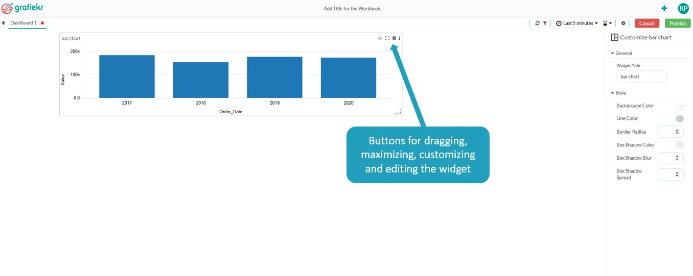
General Properties
Section titled “General Properties”Show Title
Section titled “Show Title”Use the Show Title toggle to control whether the widget title is displayed.
- Enabled – Displays the widget title.
- Disabled – Hides the widget title, allowing more space for the widget content.
Use this option when the purpose of the widget is already clear from its position or surrounding context.
Font Settings
Section titled “Font Settings”The title and any text displayed by the widget can be customized using the following font options.
1. Font Color
Section titled “1. Font Color”Choose the color of the widget text.
Use contrasting colors to ensure the text remains easy to read against the background.
2. Font Size
Section titled “2. Font Size”Specify the size of the widget text.
Larger font sizes are suitable for titles or important information, while smaller sizes are ideal for supporting text.
3. Font Family
Section titled “3. Font Family”Select the font used by the widget.
Choose a font that is consistent with the overall dashboard design and easy to read.
4. Text Style
Section titled “4. Text Style”Apply emphasis to the widget text.
Available options include:
- Bold – Makes the text more prominent.
- Italic – Adds emphasis or distinguishes secondary information.
5. Text Alignment
Section titled “5. Text Alignment”Control how text is positioned within the widget.
Available alignment options include:
- Left
- Center
- Right
Choose the alignment that best fits the content and overall dashboard layout.
The Style section allows you to customize the visual appearance of the widget container.
1.Transparent Background
Section titled “1.Transparent Background”Enable this option to make the widget background transparent.
- Enabled – The dashboard background is visible through the widget.
- Disabled – The widget uses the selected background color.
Transparent backgrounds are useful for creating a clean, seamless dashboard design.
2.Background Color
Section titled “2.Background Color”Choose the background color for the widget.
Background colors can be used to:
- Highlight important widgets
- Separate dashboard sections
- Match your organization’s branding
3. Background Opacity
Section titled “3. Background Opacity”Control the transparency of the widget background.
- 100% – Fully opaque.
- Lower values – Increasingly transparent.
Adjusting opacity can help the widget blend naturally with the dashboard background.
4. Background Image
Section titled “4. Background Image”Add an image as the widget background.
Background images can be used for:
- Corporate branding
- Decorative designs
- Section headers
- Visual emphasis
For the best user experience, ensure the image does not reduce the readability of the widget content.
5. Border
Section titled “5. Border”Enable this option to hide the widget border.
- Enabled – The border is visible through the widget.
- Disabled – The border is not visible through the widget.
6. Line Color
Section titled “6. Line Color”Specify the color of the widget border.
A border can help distinguish widgets or create visual separation between dashboard sections.
7. Border Radius
Section titled “7. Border Radius”Control the roundness of the widget corners.
- 0 px – Square corners.
- Higher values – Rounded corners.
Rounded corners provide a softer, more modern appearance.
8.Box Shadow
Section titled “8.Box Shadow”Add a shadow around the widget to create depth and visual separation.
The following properties can be configured:
9. Shadow Color
Section titled “9. Shadow Color”Select the color of the shadow.
10. Blur
Section titled “10. Blur”Controls the softness of the shadow.
- Lower values create a sharper shadow.
- Higher values create a softer, more diffused shadow.
11. Spread
Section titled “11. Spread”Controls how far the shadow extends from the widget.
Increasing the spread creates a more pronounced shadow effect.
Best Practices
Section titled “Best Practices”- Use consistent styling across all widgets to maintain a professional appearance.
- Display widget titles only when they provide useful context.
- Choose font sizes and colors that maximize readability.
- Ensure sufficient contrast between text and background colors.
- Use background colors and images sparingly to avoid distracting from the dashboard content.
- Apply border radius and shadow effects consistently for a polished, modern design.
- Preview the dashboard after making changes to verify that widgets are visually balanced and easy to read.